A bubble chart is a type of chart that displays three dimensions of data. The first dimension is represented by the size of the bubble, the second dimension is represented by the color of the bubble, and the third dimension is represented by the data point itself. This type of chart is very effective at visualizing data because it allows you to compare data points that are on different scales. For example, you can compare the sales figures of different companies or the populations of different countries. Bubble charts are also very effective at visualizing data that changes over time. For example, you can use a bubble chart to visualize the stock prices of different companies over time. Let’s take a closer look at bubble charts and how they can help you visualize data.
What is a bubble chart?
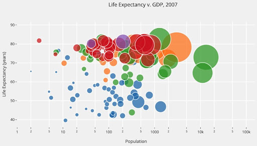
A bubble chart is a graphical way of representing data in which the areas of the circles are proportional to the values of the data. The size of each bubble is set by the value of the data and the number of decimal places used to display that value. The color of each bubble is also set by a third factor, which can be either a category or another value in the data set.
Bubble charts are useful for visualizing comparisons between two or more data sets. In particular, they can be used to compare different distributions (or “bubbles”) of data. For example, you might use a bubble chart to visualize how various age groups are distributed across a country or to compare sales figures for different products.

How do you interpret data from a bubble chart?
When reading data from a bubble chart, it is important to first identify the axes. The x-axis represents the measure of time, while the y-axis represents the measure of magnitude. Each bubble on the chart corresponds to a particular data point. In order to interpret this data correctly, it is necessary to understand how each measure is related to one another.
The x-axis measures time in chronological order, with earlier years on the left side of the chart and later years on the right side. This axis can be used to answer questions such as “What was the total value of all sales in 2014?” or “What was the average sale price in 2009?” The y-axis measures magnitude, or how large each individual data point is. This axis can be used to answer questions such as “How much did sales increase from 2009 to 2010?” or “What was the total value of all sales in 2013?”
Bubbles on a bubble chart usually correspond to a specific data point. The size of the bubble usually reflects how much that data point contributes to the total value for its corresponding year on either axis. However, it is important to remember that not all bubbles will fall perfectly along either axis – they may be off by a few thousand dollars depending on how closely each individual data point matches up with its corresponding year’s totals.
How can you create an effective bubble chart?
A bubble chart is a great way to visualize data because it can show three dimensions of data at one time. In order to create an effective bubble chart, there are a few things to keep in mind. The first thing to consider is the size of the bubbles. The bubbles should be sized so that they are easily visible and can accurately represent the data. You also want to make sure that you have enough bubbles so that each point on the chart is represented. Another important thing to consider when creating a bubble chart is how you will color the bubbles. The colors should be chosen so that they are easy to distinguish and will help communicate the meaning of the data. Finally, you need to decide how you will label the bubbles. The labels should be clear and concise so that they accurately represent the data.
Bubble charts are an efficient data analysis tool. They allow for an overall view of the data and can help identify patterns and relationships. When used appropriately, they can be a valuable tool for data analysis.