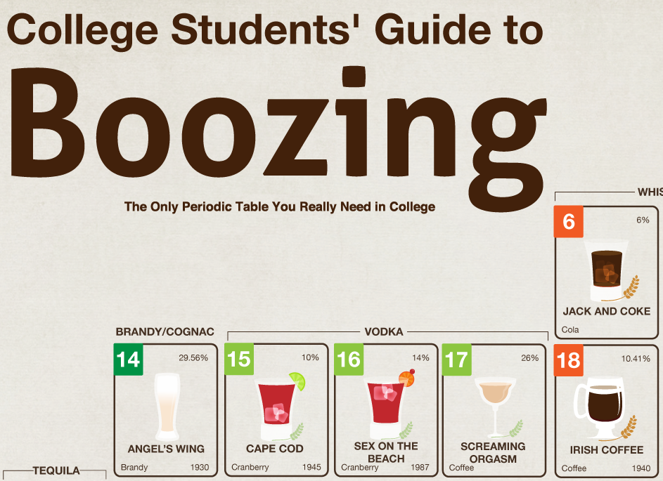
YES. Normally I’m not a huge fan of these Periodic Table infographics, but this one is freaking sick. If you’re a little bit confused, check out the key in the lower left corner, it’ll help you decipher all the numbers across the board. The only thing missing? The option to see how to mix each drink (if necessary). Print this bad boy out and cross each drink off as you go.
Tag: Information graphics

This infographic claims that college students spend an average of 100 minutes on Facebook…I’m on Facebook for at least 2 or 3 hours a day – is that too much? I can’t help that the social network is increasingly addictive (now with Skype, movie rentals, etc.), but it has its benefits for college students. Find out more after the jump.
We know that you’re probably just waking up about now. Realistically, no one in their right mind has class before noon anyway. So force yourself out of bed, have a pre-lunch burn sesh, and take a look at this delicious infographic to get your mouth watering. Afterwards, march on down to the dining hall and demand that the idiots working the grill make you a bacon-wrapped hot dog.
As an undergrad, I sneakily grabbed information from Wikipedia like it was my job…I hope none of my professors are looking at this. The trick is to reword everything so that it doesn’t look like you plagiarized, or just throw it in quotes and find the original source (they’re listed at the bottom of each page, fool). I always knew I wasn’t alone in my methods, but this infographic just reinforced that knowledge.
Alright froshies, time to get your heads straight with this infographic. Find out who’s in your major, what career you might end up in, and why you’ll probably end up changing majors at least twice. Don’t shoot the messenger, I’m just letting you in on a well-known truth.